Atlas Mobility
- Client
- Atlas Mobility
- Year
- 2024
- Role
- Brand identity, UI design, design system
- Services
- Visual identity
- App design
- Design system
- Motion
(01) The brief
Atlas lets city commuters subscribe to an e-bike for a monthly fee, servicing included. The service worked, but the app felt like a utility bill: dense screens, grey interfaces and an onboarding flow that lost a third of new sign-ups before their first ride.
(02) The approach
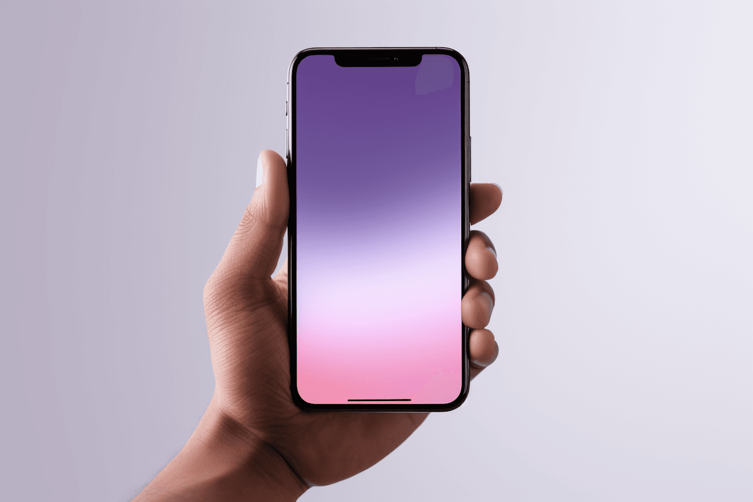
A dusk-inspired gradient became the brand's signature, shifting with the time of day inside the app. We rebuilt onboarding around one question per screen, designed a component library developers could ship straight from, and gave every ride summary something worth sharing.
(03) The outcome
+46%
onboarding completion after the redesign
The new app shipped in three phases over five months. The design system has since scaled to two new cities without a single redesign.
Juno brought clarity to a product we had made complicated. Our developers love the design system as much as our riders love the app.
Daniel Okafor
Head of Product, Atlas Mobility