Fieldnote Coffee
- Client
- Fieldnote Coffee Roasters
- Year
- 2026
- Role
- Creative direction, identity, packaging
- Services
- Brand strategy
- Visual identity
- Packaging
- Signage
(01) The brief
Fieldnote had outgrown its farmers' market stall. With a new café and a wholesale line on the way, the founders needed a brand that could hold its own on a shop shelf without losing the warmth that made regulars stop by every morning. Their old look was a borrowed font and a rubber stamp, and every new bag started from scratch.
(02) The approach
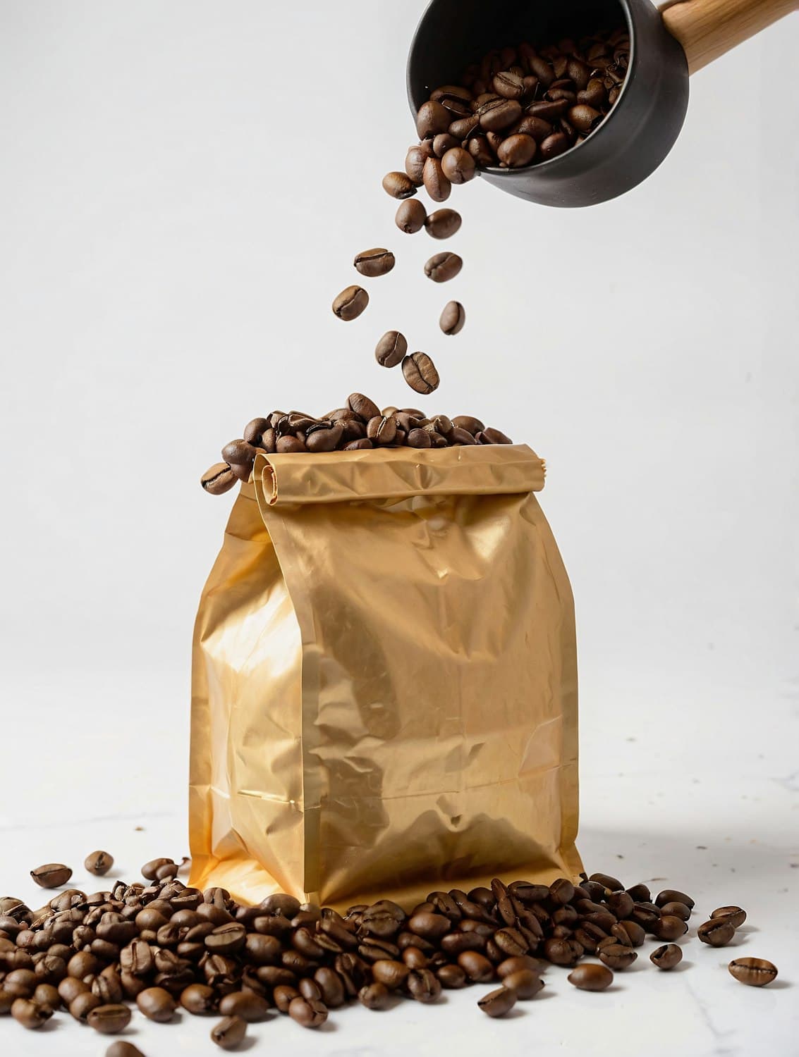
The identity grew from the notebook the roasters keep for every batch. Their handwritten tasting notes became a typographic system, a compact wordmark carries the name, and a gold foil bag gives each origin its own color-coded label. Everything was designed to be updated in-house in minutes, from bag labels to the chalkboard menu.
(03) The outcome
+38%
retail sales in the six months after launch
The new packaging launched alongside the café in early 2026. Wholesale partners now stock the full range, and the team creates new origin labels themselves without calling in a designer.
Juno understood us before we understood ourselves. People pick up our bags just to read them.
Rita Almeida
Co-founder, Fieldnote Coffee