Solene Skincare
- Client
- Solene Laboratories
- Year
- 2025
- Role
- Packaging design, art direction
- Services
- Range architecture
- Packaging design
- Print production
- Photo direction
(01) The brief
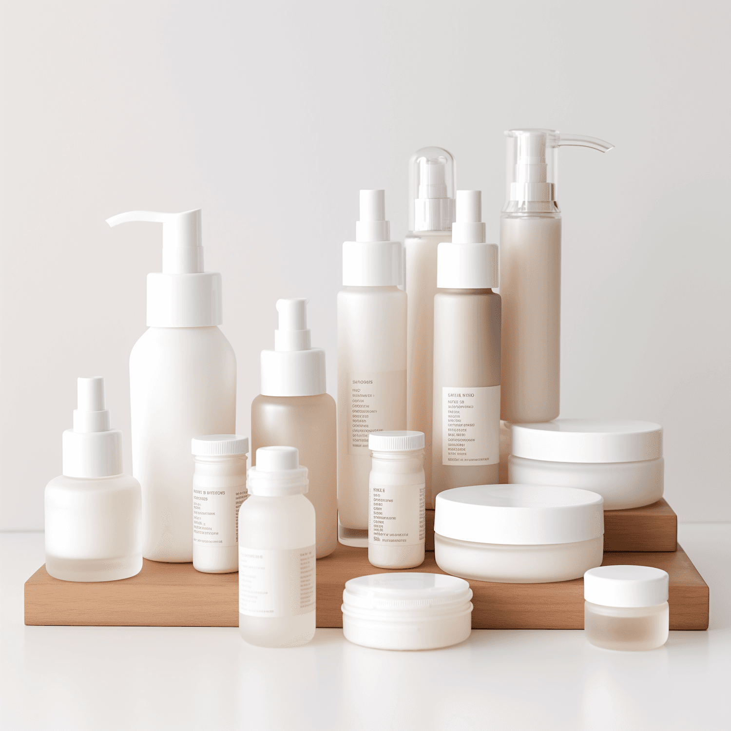
Solene's formulas were excellent, but the range had grown to fourteen products from five different suppliers with no shared system. Customers couldn't tell a cleanser from a serum at a glance, and the packaging looked far louder than the gentle products inside.
(02) The approach
We reduced the palette to frosted whites and warm nudes and let typography do the work. A simple label grid tells customers what each product is, when to use it and what's inside, in that order. Fewer finishes and one shared label size cut production complexity across every supplier.
(03) The outcome
-60%
returns caused by mixed-up orders
The redesigned range launched online and in forty pharmacies across Portugal and Spain. Returns from customers ordering the wrong product dropped sharply within the first quarter.
Our packaging finally feels like our formulas: simple, honest and calm. Retailers noticed straight away.
Marta Sousa
Founder, Solene